My personal opinion is that the magic quadrant is great to show the information in a single graph, and combined with the knowledge from Gartner and information from your own company you can make a solid decision as a CxO. However, the magic quadrant way of visualizing can be used for so much more than only they way Gartner is using it. I am currently falling inn love with this way of representing information and I recently started to use it to visualize for example the maturity of systems in combination with the business value they represent. This is working great during meetings as you can show a lot of systems in one graph in a way that is also understandable for none tech people.
 The idea came after some talks on how to represent data in a none-tech way and we came up with a gartner magic quadrant way of representing the information. Considering you will most likely have only a limited number of tools on your laptop you will most likely be bound to the options to draw such a image in Microsoft powerpoint or to make a graph in Microsoft excel. I have used Microsoft Excel for this task because I could make a framework which can be used for all future graphs I will need. below I explained how this can be done, please note in the example I will be using Microsoft Excel 2011 (version 14.0.2 build 101115) on a mac. The point that it is on a mac will not be that hard to overcome, only the graphs look a little different however the 2011 part you might want to consider if something is not working as expected.
Step 1.
first step is to get your data in a correct format. if you like to create a framework for future use you might want to reserver some space in your sheet where you can enter the data. On the X axis you please reserver 2 columns for your data. one for the values of (in the example of a Gartner magic quadrant) "completeness of vision" and one for "Ability to execute" On the Y axis you can place the product/vendor names. Before you enter your data you should think about the scale of things, you want to have a pre-defined scale on which you will be plotting 0 till 10 might be a good option however you can pick any scale you like. I have picked 0 till 7 due to some internal metric which is based upon this scale. This way you should en up with a nice formatted place to store your data, something like the example below:
 Step 2
Your second step would be to introduce a standard bubble chart. this is standard within excel, the thing you need to take into account is that you will need to do some extra setup when selecting your data. you need to create series for every line of data you created in step 1. If you would create a framework you can do a lookup to the cell for every value of the X and Y axis and the name. You will end up with something like the below example.
 Step 3.
A bubble chart is by default using a automatic horizontal and vertical axis scale which you do not want to have in this example. You want to devoid your graph in 4 equal parts where everything below a certain figure is in a certain area of your graph so you have to unset the auto scale function on your axis. Tis can be done with the format axis option of your chart. It is advisable to set the max 1 point higher than the scale you defined in step 1 and the min one point lower. This ensures that a bubble which is on the lowest (or highest) part of your scale will not be shown half because it is falling of your plot area. In the below example you can see the settings for a scale 0 till 7. After you have set you scale you want to remove the axis from the plot area so you will not see it (or need it).
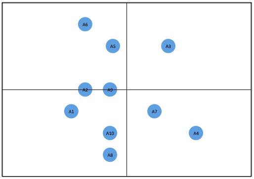
 Step 4.
In principle your magic quadrant is now done. All you have to do is some design steps. You should remove the grid lines and draw a box around your plot area. After that you need to draw a cross with vertical and horizontal lines from the middle of your box. Now you can see the magic quadrant coming to what you expect of it. From a design perspective you might want to shrink the size of the bubbles and add labels to it and position them on the left, the right, the center or any other position in respect of the bubble you feel conferrable with. You might want to do all kinds of other design things however the result till now will look something like the below example: